OPTIMIZATION OF THE SECAWAN PHYSICAL BRAND FOR THE WEB
AUGUST 2025-MARCH 2026
SYNOPSIS
Secawan is a fictional, sustainable coffee company with a physical brand and print items, but no digital presence. They are known for ethical sourcing and collaboration with charities to support the fight against malnutrition in Asia. The physical brand lacks a feasible color palette for the web (an excessive amount of swatches, and lacks accessibility for color blind people), a linear logo to conserve space, and requires making edits to existing assets with the digital color palette.
THE PROBLEM
Secawan had no digital presence. The assets and print brand was not sustainable for a digital presence and needed optimization to increase brand awareness and customer loyalty. With the release of a digital brand, Secawan may receive an increase in customers, both new and returning, as well as further promotion both digitally and by word of mouth.
MY ROLE
Although there were no other team members, collaborative efforts were briefly conducted to share individual concepts and executions of Secawan’s digital rebrand. I was the only person responsible for completing my own interpretation of Secwan’s new digital presence, from user research, to wireframing, to prototyping.

THE BEGINNING
In the beginning stages of researching, my focus was on:
Optimizing Secawan’s physical brand for the web
Considering web standards and accessibility
Performing accessibility checks on pre-determined assets
HURDLES & SOLUTIONS
Within the researching process, I noticed that certain aspects of the print brand did not translate as effectively to digital formats, particularly in terms of legibility and color visibility across various devices. To address these issues, I refined the color palette and selected new typography that would maintain the brand’s aesthetic and emotional tone, without compromising accessibility. This involved choosing colors that still evoked the same feeling of the brand, but with greater contrast and adaptability for screens, and selecting fonts that offered better scalability and clarity on digital platforms.

THE PROCESS OF CREATING DIGITAL ASSETS
Once the physical brand assets were translated to a digital format, I began researching the most effective format to promote Secawan’s upcoming website. The goal was clear: to highlight seasonal products. Given this, I analyzed the user journey and market trends, ultimately concluding that a landing page would be the optimal approach. A landing page, by design, is laser-focused, which aligns perfectly with Secawan's primary goal of promoting a specific campaign or product.
To ensure the design met user expectations and industry standards, I gathered feedback from peers. Suggestions included adjusting background contrasts and simplifying some of the layout elements for clarity. These revisions were implemented to enhance usability and visual appeal before finalizing the prototype. This feedback-driven iteration process was similarly applied to the development of other digital assets, including an email campaign, a digital newsletter, a mobile app, and website.
THE FINAL STATIC ASSETS
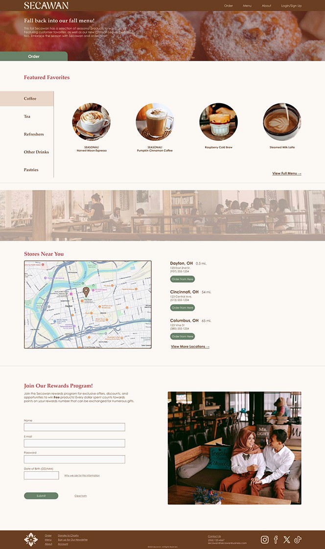
Website Prototype
Website Prototype

Email Campaign Prototype
Email Campaign Prototype

Digital Newsletter Prototype
Digital Newsletter Prototype

Landing Page Prototype
Landing Page Prototype
INTERACTIVE PROTOTYPES
OPTIMIZATION OF THE SECAWAN PHYSICAL BRAND FOR THE WEB
AUGUST 2025-MARCH 2026
SYNOPSIS
SYNOPSIS
Secawan is a fictional, sustainable coffee company with a physical brand and print items, but no digital presence. They are known for ethical sourcing and collaboration with charities to support the fight against malnutrition in Asia. The physical brand lacks a feasible color palette for the web (an excessive amount of swatches, and lacks accessibility for color blind people), a linear logo to conserve space, and requires making edits to existing assets with the digital color palette.
THE PROBLEM
THE PROBLEM
Secawan had no digital presence. The assets and print brand was not sustainable for a digital presence and needed optimization to increase brand awareness and customer loyalty. With the release of a digital brand, Secawan may receive an increase in customers, both new and returning, as well as further promotion both digitally and by word of mouth.
MY ROLE
MY ROLE
Although there were no other team members, collaborative efforts were briefly conducted to share individual concepts and executions of Secawan’s digital rebrand. I was the only person responsible for completing my own interpretation of Secwan’s new digital presence, from user research, to wireframing, to prototyping.
THE BEGINNING
In the beginning stages of researching, my focus was on:
Optimizing Secawan’s physical brand for the web
Considering web standards and accessibility
Performing accessibility checks on pre-determined assets
HURDLES & SOLUTIONS
Within the researching process, I noticed that certain aspects of the print brand did not translate as effectively to digital formats, particularly in terms of legibility and color visibility across various devices. To address these issues, I refined the color palette and selected new typography that would maintain the brand’s aesthetic and emotional tone, without compromising accessibility. This involved choosing colors that still evoked the same feeling of the brand, but with greater contrast and adaptability for screens, and selecting fonts that offered better scalability and clarity on digital platforms.
THE PROCESS OF CREATING DIGITAL ASSETS
Once the physical brand assets were translated to a digital format, I began researching the most effective format to promote Secawan’s upcoming website. The goal was clear: to highlight seasonal products. Given this, I analyzed the user journey and market trends, ultimately concluding that a landing page would be the optimal approach. A landing page, by design, is laser-focused, which aligns perfectly with Secawan's primary goal of promoting a specific campaign or product.
To ensure the design met user expectations and industry standards, I gathered feedback from peers. Suggestions included adjusting background contrasts and simplifying some of the layout elements for clarity. These revisions were implemented to enhance usability and visual appeal before finalizing the prototype. This feedback-driven iteration process was similarly applied to the development of other digital assets, including an email campaign, a digital newsletter, a mobile app, and website.
THE FINAL STATIC ASSETS
Website Prototype
Email Campaign Prototype
Digital Newsletter Prototype
Landing Page Prototype